
TESCO BACKIT
POSITIONING • VISUAL IDENTITY • VERBAL IDENTITY • MARKETING APPLICATIONS

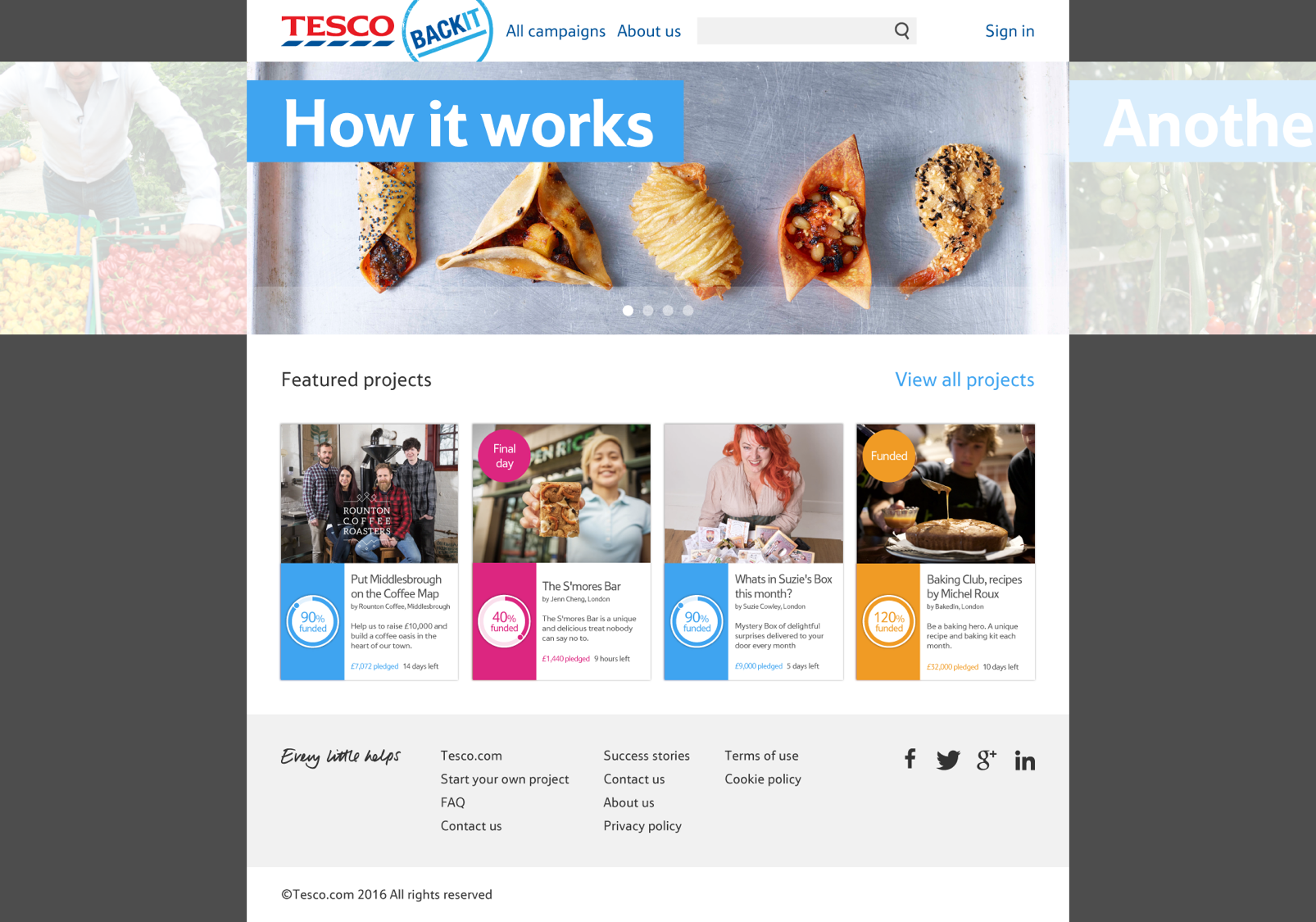
TESCO BACKIT WAS A CROWDFUNDING PLATFORM AIMED AT HELPING SMALL BUSINESSES GAIN VITAL FUNDING TO BRING THEIR PRODUCTS TO MARKET

BACKGROUND
Tesco's image woes, especially with smaller suppliers, made it crucial for Back-It to be a trustworthy platform where small food and drink firms could share their stories and launch their products.

SOLUTION
When shaping BackIt's identity, it was vital the brand came across as genuine and unpretentious, making its verbal identity key. It was also essential that BackIt's branding aligned with Tesco's brand structure, feeling like it stemmed from the retail giant while maintaining its own character; BackIt needed to spotlight its suppliers, who were at the heart of the entire initiative.

Other projects

THE EVENTS ARM OF MANSION HOUSE, CITY OF LONDON

THE LUXURY TRAVEL BRAND WITHIN THE TUI PORTFOLIO

A ZERO CARBON, A-RATED ENERGY EFFICIENT RESIDENTIAL DEVELOPMENT

A HOME BUYING AND PART-EXCHANGE SERVICE

A CONSORTIUM OF ELEVEN PROFESSIONAL CYCLING TEAMS

8 EXCEPTIONAL HOMES IN MAYFAIR, LONDON

54 SHARED OWNERSHIP APARTMENTS AND 5 PRIVATE SALE TOWNHOUSES

LUXURY BOUTIQUE APARTMENTS IN COVENT GARDEN, LONDON

181 SHARED OWNERSHIP APARTMENTS IN EARLSFIELD, LONDON

COMMERCIAL DESIGN AND FIT OUT BUSINESS IN UAE

12 APARTMENTS ON GLOUCESTER ROAD, SOUTH KENSINGTON, LONDON

GLOBAL DIGITAL MARKETING AGENCY SEEKING ECOVADIS RATING